Visualizing Motor Vehicle Fatalities with ggplot2
Updated:
An analysis of car fatalities by state using data from the Big Cities Health Initiative.
“This is my favorite part about analytics: Taking boring flat data and bringing it to life through visualization.” – John Tukey
Motivation
The last two posts were a bit dense so we’ll try to keep it simple here.
Let’s start with a morbid stat: if you’re younger than 30 and live in the United States, your most probable cause of death is a car crash.
You may have already known that. But here’s a kicker - your risk of dying in a car crash is heavily influenced by the city you live in. And although metropolitan density is an obvious factor, other variables including weather, state policy, type of car involved, and emergency response capabilities play a huge role.
In this post, we’ll be using ggplot2 - R’s de-facto plotting package 1 - to explore the relationship between city and motor vehicle fatalities in the US between 2010 and 2016.
We’ll be using data compiled from the Big Cities Health Coalition, a partnership organization comprised of public health leaders and thinkers from America’s largest cities. I’d never heard of BCHC prior to this and I was genuinely impressed with the wealth of data and analyses published on their site.
Background
In the 1950’s, the United States mortality rate due to motor vehicle crashes was about 22 per 100,000 population. That proportion peaked at about 26 in the early 1970’s and has since been steadily falling. Despite a somewhat alarming uptick in 2015, the proportion today hovers at 11 per 100,000.
While that’s undoubtedly huge progress, it still means that more than 35,000 people die as a result of a motor vehicle crash every year. According to the CDC, about 1/3 of fatalities involve drunk drivers, another 1/3 involve drivers or passengers where proper restraints were not used (meaning seat belts, car seats, etc.), and another 1/3 involve drivers that were speeding.
Another somewhat sad statistic is that the reduction in motor vehicle fatalities in the U.S. has not kept pace with that of other high income countries. On average, high income countries reduced crash deaths by 56% between 2000 and 2013, compared with 31% in the U.S CDC. Today, the mortality rate in the U.S. (the 11 per 100,000 mentioned above) is by far the highest among high-income countries.
Interestingly, states that are predominantly rural tend to have higher vehicle mortality rates. Mississippi (22.5 deaths/100,000 population), South Carolina (20.4 deaths/100,000 population), and Alabama (19.5 deaths/100,000 population) represent the highest rates, while New York (4.8 deaths/100,000 population), Massachusetts (5.2 deaths/100,000 population), and New Jersey (6.3 deaths/100,000 population) represent three of the lowest IIHS. However, this divide is much less clear when we drill down to individual cities. Cary, NC, for instance, is one of the safest cities for drivers (1.3 fatal accidents per 100,000 population), while Detroit is one of the most dangerous (16.2 fatal accidents per 100,000 population) Nerdwallet.
Ok, enough sad statistics. Let’s look at some data.
Data Preparation
Data Source
These data were taken from the data platform page on the Big Cities Health Coalition website.
Libraries
library(tidyverse)
library(viridis)
library(plotly)
Data Import
According to the website, this dataset was updated in March 2019. As loaded, the dataset contains 34,492 rows and 15 variables. We filter for only the motor vehicle fatality portion, which leaves us with 880 observations.
drive_df = read.csv(file = "../data/BCHI_dataset.csv") %>%
  janitor::clean_names() %>%
  filter(indicator == "Motor Vehicle Mortality Rate (Age-Adjusted; Per 100,000 people)")
Data Tidy
We want to make sure that the variable types R gives us are correct, variables are appropriately named, and that everything we expected in the dataframe is indeed there. We also do a quick check to make sure the data are in wide format, wherein each observation is represented by a row and each variable measured for that observation is given in a column.
str(drive_df)
## 'data.frame':	880 obs. of  15 variables:
##  $ indicator_category        : Factor w/ 13 levels "Behavioral Health/Substance Abuse",..: 9 9 9 9 9 9 9 9 9 9 ...
##  $ indicator                 : Factor w/ 61 levels "AIDS Diagnoses Rate (Per 100,000 people)",..: 21 21 21 21 21 21 21 21 21 21 ...
##  $ year                      : int  2010 2010 2010 2010 2010 2010 2010 2010 2010 2010 ...
##  $ sex                       : Factor w/ 3 levels "Both","Female",..: 1 1 1 1 1 1 1 1 1 1 ...
##  $ race_ethnicity            : Factor w/ 9 levels "All","All ","American Indian/Alaska Native",..: 1 1 1 1 1 1 1 1 1 1 ...
##  $ value                     : num  2.6 3.9 4.3 5.5 5.6 5.8 6.1 6.5 6.7 6.7 ...
##  $ place                     : Factor w/ 31 levels "Austin, TX","Baltimore, MD",..: 27 29 17 21 31 5 26 19 13 22 ...
##  $ bchc_requested_methodology: Factor w/ 184 levels "Age-adjusted rate of asthma-related ED visits using ICD-9-CM Codes: 493.0, 493.1, 493.2, 493.8, 493.0. (Numerat"| __truncated__,..: 133 134 133 134 133 133 133 133 133 133 ...
##  $ source                    : Factor w/ 659 levels "","(500 Cities Project)",..: 1 649 292 33 1 1 93 324 306 495 ...
##  $ methods                   : Factor w/ 291 levels "","\"Vaccinated for flu in the past 12 months\"",..: 1 1 31 275 1 1 86 237 1 1 ...
##  $ notes                     : Factor w/ 483 levels ""," Records where the value is blank in the data table indicate that the data are suppressed due to small counts, "| __truncated__,..: 472 1 1 1 1 1 1 1 1 1 ...
##  $ x90_confidence_level_low  : num  NA NA NA NA NA NA NA NA NA NA ...
##  $ x90_confidence_level_high : num  NA NA NA NA NA NA NA NA NA NA ...
##  $ x95_confidence_level_low  : num  2 2.5 NA 3.5 NA NA NA NA 5.1 5.4 ...
##  $ x95_confidence_level_high : num  3.4 6 NA 8.3 NA NA NA NA 8.7 7.9 ...
It looks like things are pretty clean. Most of the categorical variables, including race, sex, and city were read in as factors, while the mortality values and corresponding confidence intervals were read in using the double class. The only thing to fix is the source, methods, and notes variables, which should technically be strings since they don’t contain any logical levels. I’m also going to change year to a categorical variable so R doesn’t get confused trying to analyze it continuously.
drive_df =
  drive_df %>%
  mutate(year = as.factor(year),
         source = as.character(source),
         methods = as.character(methods),
         notes = as.character(notes)
  )
Variables Used
The variables we care about here are:
year: 2010 through 2016sex: Male, female, and the combined value under Bothrace_ethnicity: American Indian/Alaska Native, Asian/PI, Black, Hispanic, Other, White, and combined valued (All)value: the mortality value we’ll be analyzing (i.e. our dependent variable); the details are given underbchc_requested_methodology, which explains thatvalueis equal to motor vehicle deaths per 100,000 population using 2010 US Census figures, age adjusted to the 2000 census standard population. 2x90_confidence_level_lowandx90_confidence_level_high: 90% confidence interval aroundvaluex95_confidence_level_lowandx95_confidence_level_high: 95% confidence interval aroundvalue
Visualizing Motor Vehicle Fatalities
ggplot2 works by layering graphical elements on top of one another. These layers are referred to as “geoms” and they include things like axes, grid lines, color schemes points representing your data, trend-lines connecting your data, shaded regions representing confidence intervals, and plot labels, titles, and legends. Creating a final graph requires you to define each element individually and “add” it to the ggplot() call.
The best way to explain ggplot2 is, of course, to demonstrate it. Let’s first just apply the function to our dataframe drive_df to see what happens.
drive_df %>%
  ggplot()

We get this lovely gray square. Who doesn’t love gray squares?
This may seem silly but the point is to demonstrate that ggplot2 needs you to state what you want.
The first thing we need to do is tell ggplot2 what our dependent and independent variables are. We’re interested in motor vehicle mortality year over year, so let’s try the following:
drive_df %>%
  ggplot(x = year, y = value)

Wait what?
And this is one of the first lessons of ggplot2. In order to control how things look within a geom, you have to set what are known as aesthetics.
Aesthetics
Aesthetics set within the ggplot function itself (i.e. before geoms are defined) are global aesthetics that apply to the entire plot. Aesthetics set within a geom apply only to that geom. Therefore, when we define axes, we want to set them globally within a ggplot(aes() call:
drive_df %>%
  ggplot(aes(x = year, y = value))
Ah, now we’re getting somewhere.
Let’s attempt to create a plot of motor vehicle mortality as a function of year. We know that we have data from 2010 through 2016 and that the data are collected (or compiled) annually. In order to get some points for each year, we’ll need to “add” a point geom to ggplot2:
drive_df %>%
  ggplot(aes(x = year, y = value)) +
  geom_point()
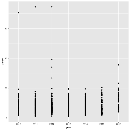
Clearly this is a pretty bad plot and if you ever see something like this published, please assume that the author doesn’t know much about plots. For one thing, using a scatterplot doesn’t make sense because the year variable was measured categorically rather than continuously. BUT… this does show us something important in the data: outliers. On the left, we have points hovering at 70-75 deaths per 100,000. Recall that in the 1970s, when motor vehicle deaths peaked, the average values reached into the mid-20s. So clearly, 75 is astronomical. Let’s take a detour and investigate this a bit more. I’m going to go back to the dataframe and sort in order of decreasing value:
drive_df %>%
  arrange(desc(value)) %>%
  head()
##   indicator_category
## 1    Injury/Violence
## 2    Injury/Violence
## 3    Injury/Violence
## 4    Injury/Violence
## 5    Injury/Violence
## 6    Injury/Violence
##                                                         indicator year  sex
## 1 Motor Vehicle Mortality Rate (Age-Adjusted; Per 100,000 people) 2011 Both
## 2 Motor Vehicle Mortality Rate (Age-Adjusted; Per 100,000 people) 2012 Both
## 3 Motor Vehicle Mortality Rate (Age-Adjusted; Per 100,000 people) 2010 Both
## 4 Motor Vehicle Mortality Rate (Age-Adjusted; Per 100,000 people) 2012 Both
## 5 Motor Vehicle Mortality Rate (Age-Adjusted; Per 100,000 people) 2016 Both
## 6 Motor Vehicle Mortality Rate (Age-Adjusted; Per 100,000 people) 2012 Both
##                  race_ethnicity value           place
## 1                         Other  74.4      Denver, CO
## 2                         Other  74.4      Denver, CO
## 3 American Indian/Alaska Native  70.5 Minneapolis, MN
## 4 American Indian/Alaska Native  39.4 Minneapolis, MN
## 5                      Hispanic  35.6 Minneapolis, MN
## 6                      Hispanic  34.1 Minneapolis, MN
##                                                                                                                                                                                                                                                                             bchc_requested_methodology
## 1 Motor vehicle deaths per 100,000 population using 2010 US Census figures, age adjusted to the year 2000 standard population. ICD-10 Codes: V02-V04, V09.0, V09.2, V12-V14, V19.0-V19.2, V19.4-V19.6, V20-V79, V80.3-V80.5, V81.0-V81.1, V82.0-V82.1, V83-V86, V87.0-V87.8, V88.0-V88.8, V89.0, V89.2
## 2 Motor vehicle deaths per 100,000 population using 2010 US Census figures, age adjusted to the year 2000 standard population. ICD-10 Codes: V02-V04, V09.0, V09.2, V12-V14, V19.0-V19.2, V19.4-V19.6, V20-V79, V80.3-V80.5, V81.0-V81.1, V82.0-V82.1, V83-V86, V87.0-V87.8, V88.0-V88.8, V89.0, V89.2
## 3 Motor vehicle deaths per 100,000 population using 2010 US Census figures, age adjusted to the year 2000 standard population. ICD-10 Codes: V02-V04, V09.0, V09.2, V12-V14, V19.0-V19.2, V19.4-V19.6, V20-V79, V80.3-V80.5, V81.0-V81.1, V82.0-V82.1, V83-V86, V87.0-V87.8, V88.0-V88.8, V89.0, V89.2
## 4 Motor vehicle deaths per 100,000 population using 2010 US Census figures, age adjusted to the year 2000 standard population. ICD-10 Codes: V02-V04, V09.0, V09.2, V12-V14, V19.0-V19.2, V19.4-V19.6, V20-V79, V80.3-V80.5, V81.0-V81.1, V82.0-V82.1, V83-V86, V87.0-V87.8, V88.0-V88.8, V89.0, V89.2
## 5 Motor vehicle deaths per 100,000 population using 2010 US Census figures, age adjusted to the year 2000 standard population. ICD-10 Codes: V02-V04, V09.0, V09.2, V12-V14, V19.0-V19.2, V19.4-V19.6, V20-V79, V80.3-V80.5, V81.0-V81.1, V82.0-V82.1, V83-V86, V87.0-V87.8, V88.0-V88.8, V89.0, V89.2
## 6 Motor vehicle deaths per 100,000 population using 2010 US Census figures, age adjusted to the year 2000 standard population. ICD-10 Codes: V02-V04, V09.0, V09.2, V12-V14, V19.0-V19.2, V19.4-V19.6, V20-V79, V80.3-V80.5, V81.0-V81.1, V82.0-V82.1, V83-V86, V87.0-V87.8, V88.0-V88.8, V89.0, V89.2
##                              source
## 1 Colorado Vital Records Death Data
## 2 Colorado Vital Records Death Data
## 3        Minnesota Vital Statistics
## 4        Minnesota Vital Statistics
## 5        Minnesota Vital Statistics
## 6        Minnesota Vital Statistics
##                                                                                                                         methods
## 1                                                            2011-2013 years are the most recently available data at this time.
## 2                                                            2011-2013 years are the most recently available data at this time.
## 3 Rates per 100,000 calculated using the Minneapolis 2010 Census population; age-adjusted using the 2000 US standard population
## 4 Rates per 100,000 calculated using the Minneapolis 2010 Census population; age-adjusted using the 2000 US standard population
## 5
## 6 Rates per 100,000 calculated using the Minneapolis 2010 Census population; age-adjusted using the 2000 US standard population
##   notes x90_confidence_level_low x90_confidence_level_high
## 1                             NA                        NA
## 2                             NA                        NA
## 3                             NA                        NA
## 4                             NA                        NA
## 5                             NA                        NA
## 6                             NA                        NA
##   x95_confidence_level_low x95_confidence_level_high
## 1                       NA                        NA
## 2                       NA                        NA
## 3                       NA                        NA
## 4                       NA                        NA
## 5                       NA                        NA
## 6                       NA                        NA
The top three outliers belong to 2011 Denver, CO (74.4 deaths), 2012 Denver, CO (also 74.4 deaths), and 2010 Minneapolis, MN (70.5 deaths). What’s important is that these are race-stratified. While all three represent total values for both males and females, the Denver numbers represent data for race labeled “Other” and the Minneapolis number belongs to the American Indian/Alaska Native population. If we wanted to dig around, we could perhaps find the original Denver and Minneapolis data and double check these numbers. They might be correct or they might be attributed to typos.
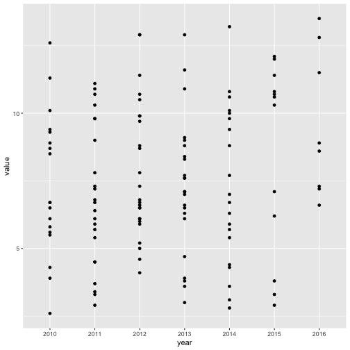
In this case, we’re not interested in racial distribution for the moment, so we’re going to restrict our dataset to the collapsed values, meaning those representing the averages of both sexes and all races. Then we’ll re-attempt the pseudo-scatterplot.
drive_df %>%
  filter(sex == "Both", race_ethnicity == "All") %>%
  ggplot(aes(x = year, y = value)) +
  geom_point()

Ok, that’s a little better, but it still doesn’t tell us anything interesting. Each year has many data points representing an individual city and on this plot, it’s impossible to tell which city corresponds to which point. We’ll come back to this question in a moment, but for now, let’s try to extract something useful from the plot. Let’s try to answer the question: on average, did motor vehicle fatalities in the U.S. increase, decrease, or remain stable between 2010 and 2016? To visualize the answer, we’ll need a plot that can show us the center value of each year, and maybe some indication of the distribution within that year. Enter the boxplot.
Boxplots
I love a good boxplot (perhaps even more than I love a good gray square). Here’s a wonderful TDS post on boxplots.
Let’s quickly toss in a boxplot geom:
drive_df %>%
  filter(sex == "Both", race_ethnicity == "All") %>%
  ggplot(aes(x = year, y = value)) +
    geom_boxplot()
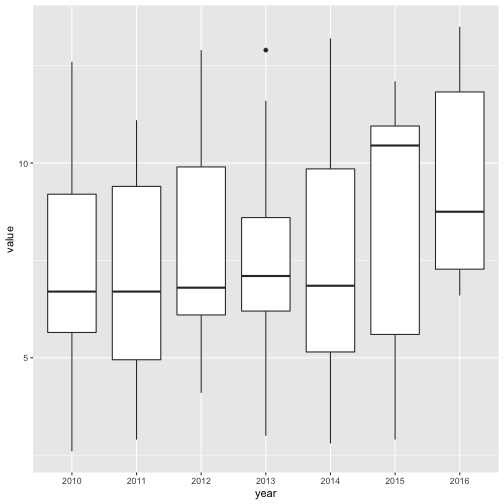
Brilliant! Immediately we gleaned a useful nugget of information: there was an alarming spike in the data. Things were chugging along and then something happened in 2015. If you do a news search on this topic, you’ll see that public health and safety folks noticed this, too. It looks like fuel prices and job growth were potential culprits, but either way, this is clearly a very useful insight.
Let’s spice this plot up a bit. Let’s say we want to compare men and women in the same time frame. We will need to specify a color code within the aesthetic for geom_boxplot and we’ll also need to filter out the “Both” values for sex, since we just want male vs female.
drive_df %>%
  filter(race_ethnicity == "All", !sex == "Both") %>%
  ggplot(aes(x = year, y = value, fill = sex)) +
    geom_boxplot()
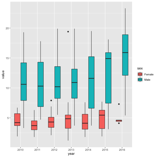
NICE. These are meaty results. There’s an obvious disparity in mortality between males and females. Most years, male fatality averages are more than double that of females, and some years (2015, for instance) it’s more like triple. The female boxplot for 2016 also looks suspiciously narrow. It’s worth investigating but for now let’s move on.
I’m not a huge fan of that color scheme, so let’s use some nicer colors. For two-tone plots, I like to just manually choose the colors (there are a million color tools online, but this one is my favorite). For three or more colors, I normally use a package like RColorBrewer (built-in) or the extra-fancy viridis package, which you’d need to install. I’m also going to get rid of the gray background using a theme and change the opacity of the fill color using an alpha statement (the latter is just personal preference). Finally, I’ll capitalize the axis labels, and add a title and caption.
drive_df %>%
  filter(race_ethnicity == "All", !sex == "Both") %>%
  ggplot(aes(x = year, y = value, fill = sex)) +
    #change outline color to gray
    geom_boxplot(alpha = 0.7) +
    scale_fill_manual(values=c("#996699", "#99CC99")) +
    theme_bw() +
    labs(
      title = "Motor Vehicle Fatality Rate 2010-2016 by Sex",
      x = "Year",
      y = "Fatality (death/100,000 population)",
      caption = "Data source: Big Cities Health Initiative"
    )
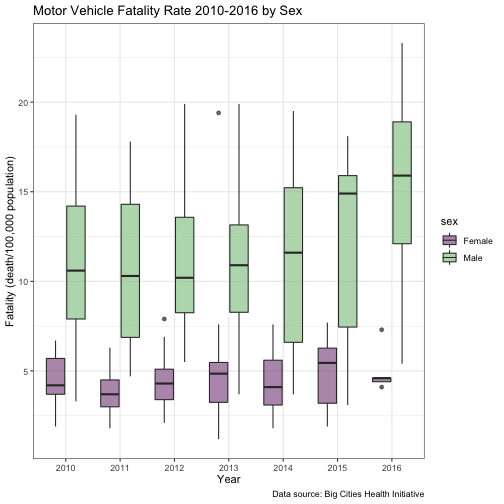
Great, we wound up with a nice-looking boxplot with some useful information.
Violin Plots
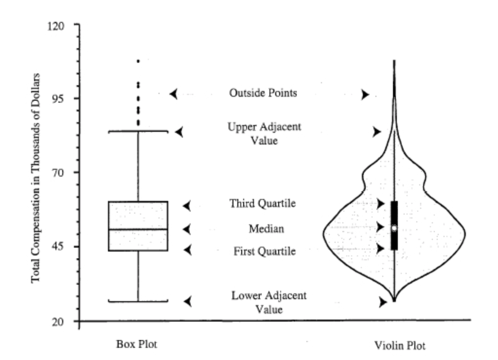
Now let’s take a look at a cousin of the boxplot: the violin plot. All you really need to know to understand how it works is shown in this figure, taken from another TDS post.
There was a time a few years back when everyone thought violin plots were the best thing since sliced bagels. The trend seems to have somewhat faded but I think they’re nice so let’s make one.
drive_df %>%
  filter(sex == "Both", race_ethnicity == "All") %>%
  ggplot(aes(x = year, y = value)) +
    geom_violin()
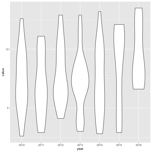
Is it just me or do these look like a Dr. Seuss version of stick-figures?
Anyway, these aren’t very “violin-y” but the point is that higher frequencies of values lead to wider parts of the plots and vice-versa. If we want to see a more violin shape, we can combine some of the years to get more data points per ‘violin”. Let’s do that here:
drive_df %>%
  filter(sex == "Both", race_ethnicity == "All") %>%
  mutate(year_group = if_else(year %in% c(2010, 2011, 2012), "2010-2012", "2013-2016")) %>%
  ggplot(aes(x = year_group, y = value)) +
    geom_violin()
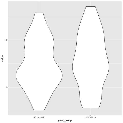
Much more violin-like! Clearly, the 2010-2012 group had most of its data points in the 6-6.5 range, while 2013-2016 was a bit more spread out across its range of values and its median is a bit higher (probably driven by that alarming 2015 number).
What if we split out males vs females like we did in our boxplots?
violin =
drive_df %>%
  filter(!sex == "Both", race_ethnicity == "All") %>%
  mutate(year_group = if_else(year %in% c(2010, 2011, 2012), "2010-2012", "2013-2016")) %>%
  ggplot(aes(x = year_group, y = value, fill = sex)) +
    geom_violin(alpha = 0.7)

violin
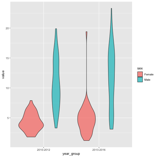
Cute, right? The gender difference we saw in the boxplots is even more detailed here.
Let’s clean this up a bit and then we’re going to do something really exciting.
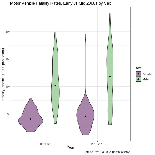
violin_1 =
  violin +
  scale_fill_manual(values=c("#996699", "#99CC99")) +
  theme_bw() +
  labs(
      title = "Motor Vehicle Fatality Rates, Early vs Mid 2000s by Sex",
      x = "Year",
      y = "Fatality (death/100,000 population)",
      caption = "Data source: Big Cities Health Initiative"
    )

violin_1

All right, let’s get extra fancy. We’re going to use a function within ggplot2 called stat_summary to give us some extra detail.
stat_summary()
stat_summary does just what it sounds like - it summarizes stats. We’ve been using stats within our geoms this whole time, we just didn’t know about it because ggplot2 does it in the background. For instance, the boxplot geom calculates the median, 25th, and 75th percentile stats.
Here, we’ll add dots to indicate the median in each violin. The position_dodge function moves the dots inside the violins, as opposed to positioning them directly on the gridline.
violin_1 +
  stat_summary(fun = median, geom="point", position = position_dodge(width = 0.9))
violin_1 +
  stat_summary(fun.data = mean_sdl, geom = "pointrange", position = position_dodge(width = 0.9))
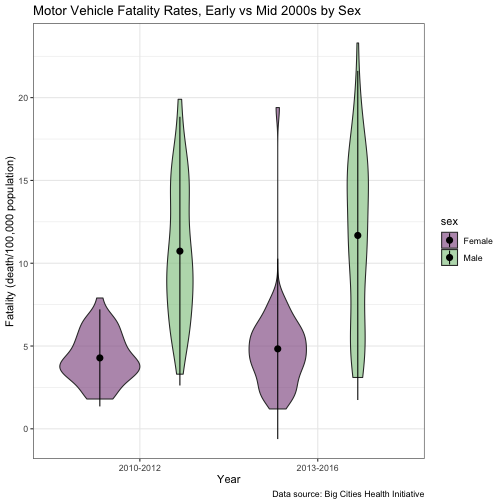
There are lots of other stats you can layer on. You can even embed little boxplots within the violin plots. This page gives a great summary, but for our purposes we’re going to end our mini-tour of violin plots here and move on.
Points and Lines
Now let’s come back to our initial question of how motor vehicle fatalities differ across cities in the U.S. Recall that we started with the scatterplot below:
drive_df %>%
  filter(sex == "Both", race_ethnicity == "All") %>%
  ggplot(aes(x = year, y = value)) +
  geom_point()
Every dot represents a city and every city has a value for every year of measurement, so of course we want to know which dot belongs to which city.
Let’s start with some basic color-coding.
drive_df %>%
  filter(sex == "Both", race_ethnicity == "All") %>%
  ggplot(aes(x = year, y = value)) +
  geom_point(aes(color = place))
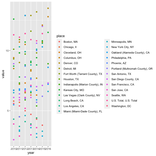
Yikes. It’s basically impossible to distinguish any of these colors from one another, or to follow the trajectory of any city year to year. We need lines rather than dots. We also need ggplot2 to know that each city should be treated as a grouping (this latter point is not super intuitive to me, but just know that it doesn’t work otherwise).
drive_df %>%
  filter(sex == "Both", race_ethnicity == "All") %>%
  ggplot(aes(x = year, y = value, group = place)) +
  geom_line()
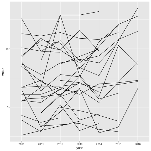
Does this bring back fond Etch A Sketch memories?
What we’ve created here is called a spaghetti plot for reasons that should be obvious. Clearly we need colors though. Let’s drop a color aesthetic into our line geom.
spaghetti_plot =
drive_df %>%
  filter(sex == "Both", race_ethnicity == "All") %>%
  ggplot(aes(x = year, y = value, group = place)) +
  geom_line(aes(color = place))

spaghetti_plot
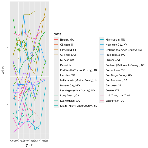
Double yikes. Too many similar colors. Also, too much legend.
spaghetti_plot_1 =
  spaghetti_plot +
  scale_color_viridis(discrete = TRUE) +
  theme_bw() +
  theme(legend.position = "bottom", legend.title = element_text(size = 8),
  legend.text = element_text(size = 6)
  ) +
  labs(
      title = "Motor Vehicle Fatality Rates by City",
      x = "Year",
      y = "Fatality (death/100,000 population)",
      caption = "Data source: Big Cities Health Initiative"
    )

spaghetti_plot_1
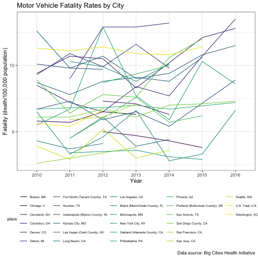
That’s a lot better, but there’s still no way anyone would be able to distinguish Houston from Indianapolis, or even be able to infer which city has the highest crash fatality burden versus lowest. And this is where interactivity comes in handy.
A word of warning, it’s easy to over-do interactivity and go nuts with things like plotly because it’s fun and flashy. Don’t do it. If it doesn’t add value to visualizing patterns in the data, it doesn’t have any place on your plot.
ggplotly
In this case, we definitely want some interactivity to help us understand the data. We’re going to use ggplotly, a convenient marriage of plotly and ggplot2. You can hover on a line to see which city it represents, or double any city in the legend to isolate it on the plot.
spaghetti_plot_1 %>%
  ggplotly()
Isn’t this amazing? I’m blown away that one additional line of code did all that.
Faceting
Ok, one last trick. Say we wanted to give each city its own little plot to understand time-trends within the city. We can certainly get this information from the spaghetti plot but it would undoubtedly cause a headache. Let’s play with facet_wrap and facet_grid instead.
The difference between these two isn’t super clear to start with, but basically, facet_wrap is good if you’re just faceting on one variable (in our case, city). If you want to end up with a separate mini-plot for each combination of two variables (for instance, a mini-plot for female fatalities in Denver, another plot for male fatalities in Denver, and so on for every combination of city and sex), you want facet_grid (more info here).
We’re going to start with facet_wrap.
drive_df %>%
  filter(sex == "Both", race_ethnicity == "All") %>%
  ggplot(aes(x = year, y = value, group = place)) +
  geom_line() +
  facet_wrap(vars(place))
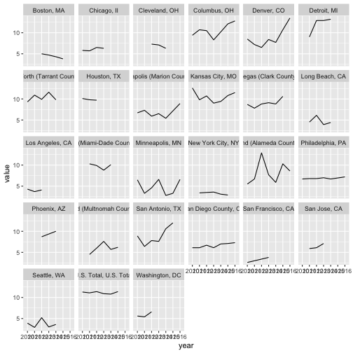
Aside from the fact that the x-axis labels are a bit messed up, this is actually pretty nice.
Now let’s try a grid for combinations of place and sex.
drive_df %>%
  filter(!sex == "Both", race_ethnicity == "All") %>%
  ggplot(aes(x = year, y = value, group = place)) +
  geom_line() +
  facet_grid(sex ~ place)
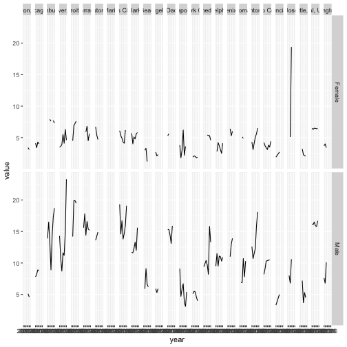
Oh boy. Let’s go back to facet_wrap and just do some color-coding for sex rather than trying to make sense of this crazy grid.
drive_df %>%
  filter(!sex == "Both", race_ethnicity == "All") %>%
  ggplot(aes(x = year, y = value, group = sex)) +
  geom_line(aes(color = sex)) +
  facet_wrap(vars(place))
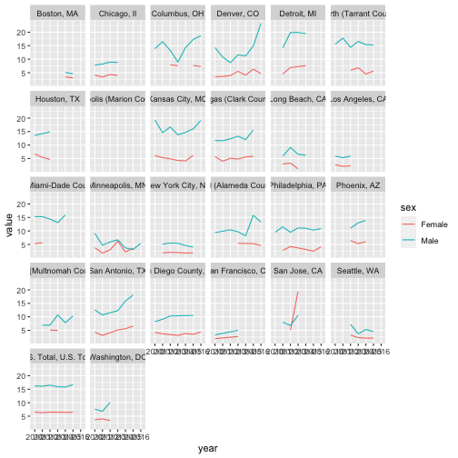
NIIIIICE. If we fix the formatting, this will actually be an ok plot. First off, we should minimize the number of plots displayed horizontally using ncol.
drive_df %>%
  filter(!sex == "Both", race_ethnicity == "All") %>%
  ggplot(aes(x = year, y = value, group = sex)) +
  geom_line(aes(color = sex)) +
  facet_wrap(vars(place), ncol = 3)
Next, let’s fix up the colors, axes, legend, etc.
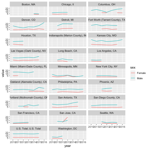
drive_df %>%
  filter(!sex == "Both", race_ethnicity == "All") %>%
  ggplot(aes(x = year, y = value, group = sex)) +
  geom_line(aes(color = sex)) +
  scale_color_manual(values=c("#996699", "#99CC99")) +
  facet_wrap(vars(place), ncol = 3)  +
    theme_bw() +
    labs(
      title = "Motor Vehicle Fatality Rate 2010-2016 by Sex",
      x = "Year",
      y = "Fatality (death/100,000 population)",
      caption = "Data source: Big Cities Health Initiative"
    )
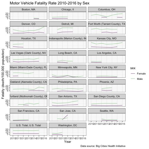
I’m pretty happy with that. It’s clear we have an issue with Indianapolis (perhaps they only provide the combined male/female figure but not the individual values). It’s also clear that Boston had only 2 years of data and other cities have some missing data as well. But a more interesting finding is comparing Denver to Detroit, which are conveniently side-by-side. Detroit saw a leveling off, whereas Denver saw a sharp increase in male fatalities. San Jose sticks out, too, as the only city where female fatalities surpassed male fatalities (and sharply so…) If I were an analyst looking at traffic safety, I’d put some focus on Denver and San Jose and figure out what’s going on there.
Conclusions
I hope you agree that we did some fun stuff and learned a bit about car crash fatalities. My takeaways were:
- There is a huge disparity between male and female motor vehicle fatalities in nearly every big city in the U.S., males experiencing double and sometimes triple the female average fatality rate.
- Detroit has historically had the highest burden of motor vehicle fatalities, but Denver has recently caught up.
ggplot2is very cool.ggplotlyis also very cool.
This is absolutely just a surface-scratch of all the things ggplot2 can do, so please take a look at the links below for more complete package exploration.
Further Reading
- A handy cheat sheet
- A beautiful collection of R data viz inspiration
References
- Michonneau F, Teal T, Fournier A, Seok B, Obeng A, Pawlik AN, Conrado AC, Woo K, Lijnzaad P, Hart T, White EP, Marwick B, Bolker B, Jordan KL, Ashander J, Dashnow H, Hertweck K, Cuesta SM, Becker EA, Guillou S, Shiklomanov A, Klinges D, Odom GJ, Jean M, Mislan KAS, Johnson K, Jahn N, Mannheimer S, Pederson S, Pletzer A, Fouilloux A, Switzer C, Bahlai C, Li D, Kerchner D, Rodriguez-Sanchez F, Rajeg GPW, Ye H, Tavares H, Leinweber K, Peck K, Lepore ML, Hancock S, Sandmann T, Hodges T, Tirok K, Jean M, Bailey A, von Hardenberg A, Theobold A, Wright A, Basu A, Johnson C, Voter C, Hulshof C, Bouquin D, Quinn D, Vanichkina D, Wilson E, Strauss E, Bledsoe E, Gan E, Fishman D, Boehm F, Daskalova G, Tavares H, Kaupp J, Dunic J, Keane J, Stachelek J, Herr JR, Millar J, Lotterhos K, Cranston K, Direk K, Tylén K, Chatzidimitriou K, Deer L, Tarkowski L, Chiapello M, Burle M, Ankenbrand M, Czapanskiy M, Moreno M, Culshaw-Maurer M, Koontz M, Weisner M, Johnston M, Carchedi N, Burge OR, Harrison P, Humburg P, Pauloo R, Peek R, Elahi R, Cortijo S, sfn_brt, Umashankar S, Goswami S, Sumedh, Yanco S, Webster T, Reiter T, Pearse W, Li Y (2020). “datacarpentry/R-ecology-lesson: Data Carpentry: Data Analysis and Visualization in R for Ecologists, June 2019.” doi: 10.5281/zenodo.3264888, https://datacarpentry.org/R-ecology-lesson/.
-
There are people who would trash me for making that statement, given that R has an actual base graphics package and from what I’ve seen, it works just fine. Data people on the internet sometimes argue against
ggplot2since it seems the base graphics can get you similar results with less code. I have no position on the matter - I useggplot2because I’m a sheep and that’s what everyone else seems to use (and hence, what you can find a lot more online help for). ↩ -
Age adjustment is a method used in epidemiology when comparing rates of disease or mortality between populations with different age breakdowns. Roughly speaking, if the population of Austin TX, for instance, is much younger than the average U.S. population, it doesn’t make sense to compare mortality rates directly. We know that older people die more frequently than younger people, so if we want an apples-to-apples comparison of two populations we have to use a weighting scheme. And that’s all age standardization is - a weighting scheme that assigns more weight to certain age categories to “equalize” their weight to that of the reference population. In our example, older people in Austin would get weighted more than younger people. ↩